Casino analytics study, brand and app
Wagerline
On-chain casino analytics, read from wallets rather than from what operators report.
Overview
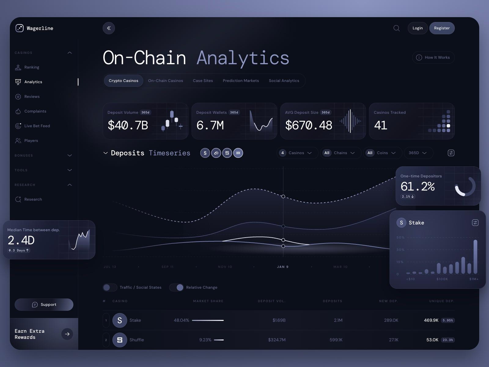
Wagerline started as a study: we rebuilt an on-chain casino analytics dashboard concept called BetFlux, shared on Dribbble, to learn how it was put together. Credit for that original layout and visual style goes to its designer. We then gave it a new name and mark, and built the pages the concept never showed.
- Year
- 2026
- Scope
- Naming, identity, product screens
- Platform
- Web app
- Type
- DM Mono and DM Sans
Study
Rebuilding a concept to learn it
We rebuilt the BetFlux dashboard by hand as a working web page: sidebar, headline figures, a deposits chart and a table of casinos. Rebuilding it showed how the glassy cards, the monospaced figures and one soft periwinkle hold the dark layout together. The layout and style are the original designer’s; everything after this step is ours.

Name
Wagerline
A wager is the bet, a line is the chart that tracks it. Put together they describe the product: every bet on the chain, followed over time.

Mark
A die that reads as a chart
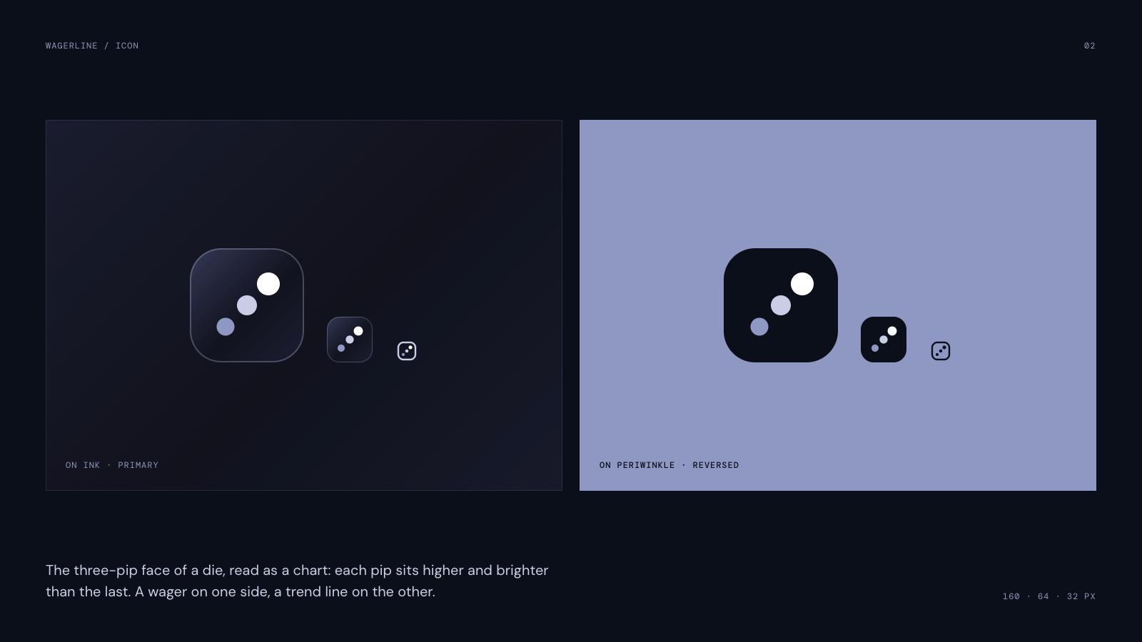
The three-pip face of a die, read as a chart: each pip sits higher and brighter than the last. A wager on one side, a trend line on the other. It holds up from app icon down to 32 pixels.
Colour and type
Periwinkle on ink
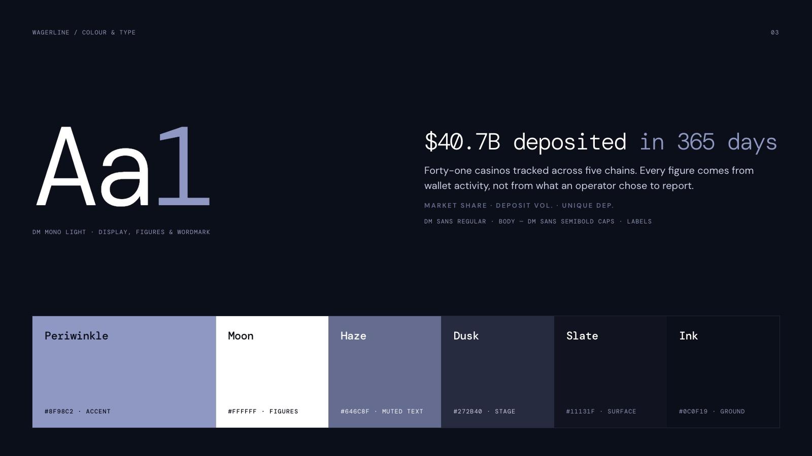
The palette follows the concept: deep blue-black surfaces, white for figures and one periwinkle accent for the word that comes second. DM Mono Light carries headlines and numbers, DM Sans the body and small caps labels.
Product
The pages the concept left out
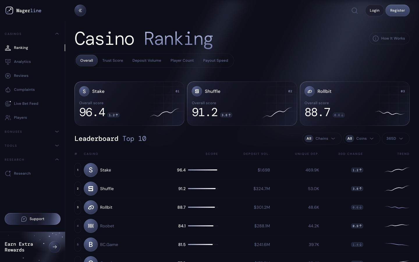
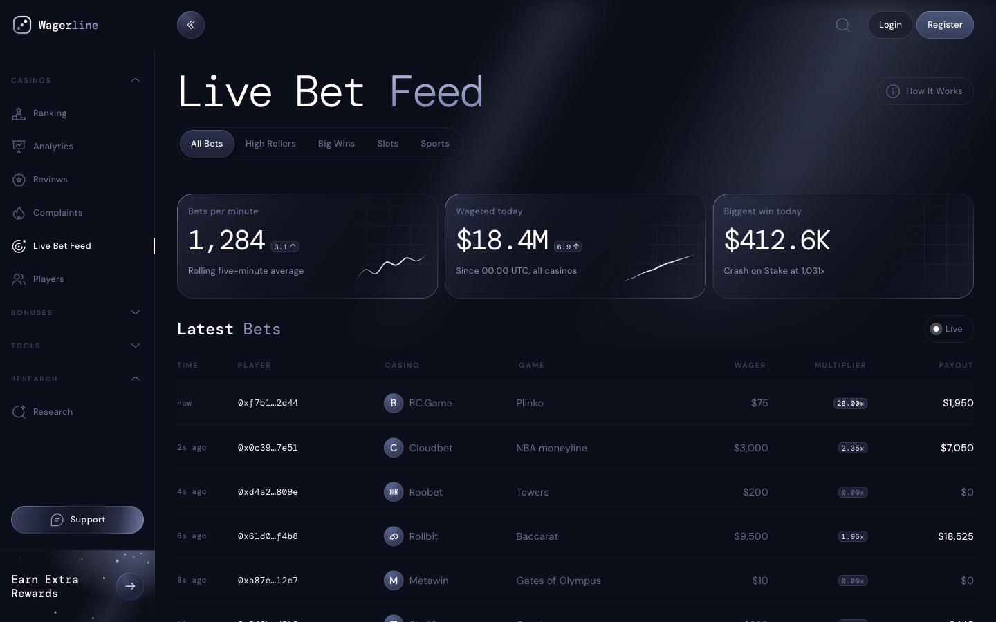
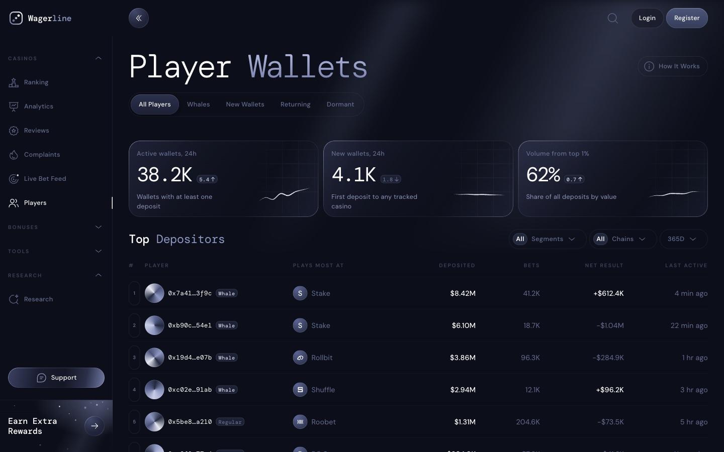
The concept showed one screen. We designed the rest of the app in the same system: a casino ranking, reviews, complaints, player wallets, a live bet feed and research.
Next project
Tally →
Sales dashboard study, brand and website