Sales dashboard study, brand and website
Tally
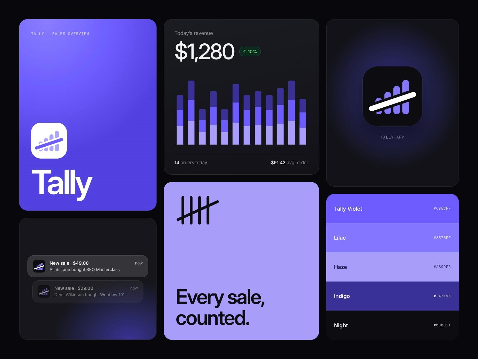
Sales, orders and revenue counted in one place, so a small team always knows the score.
Overview
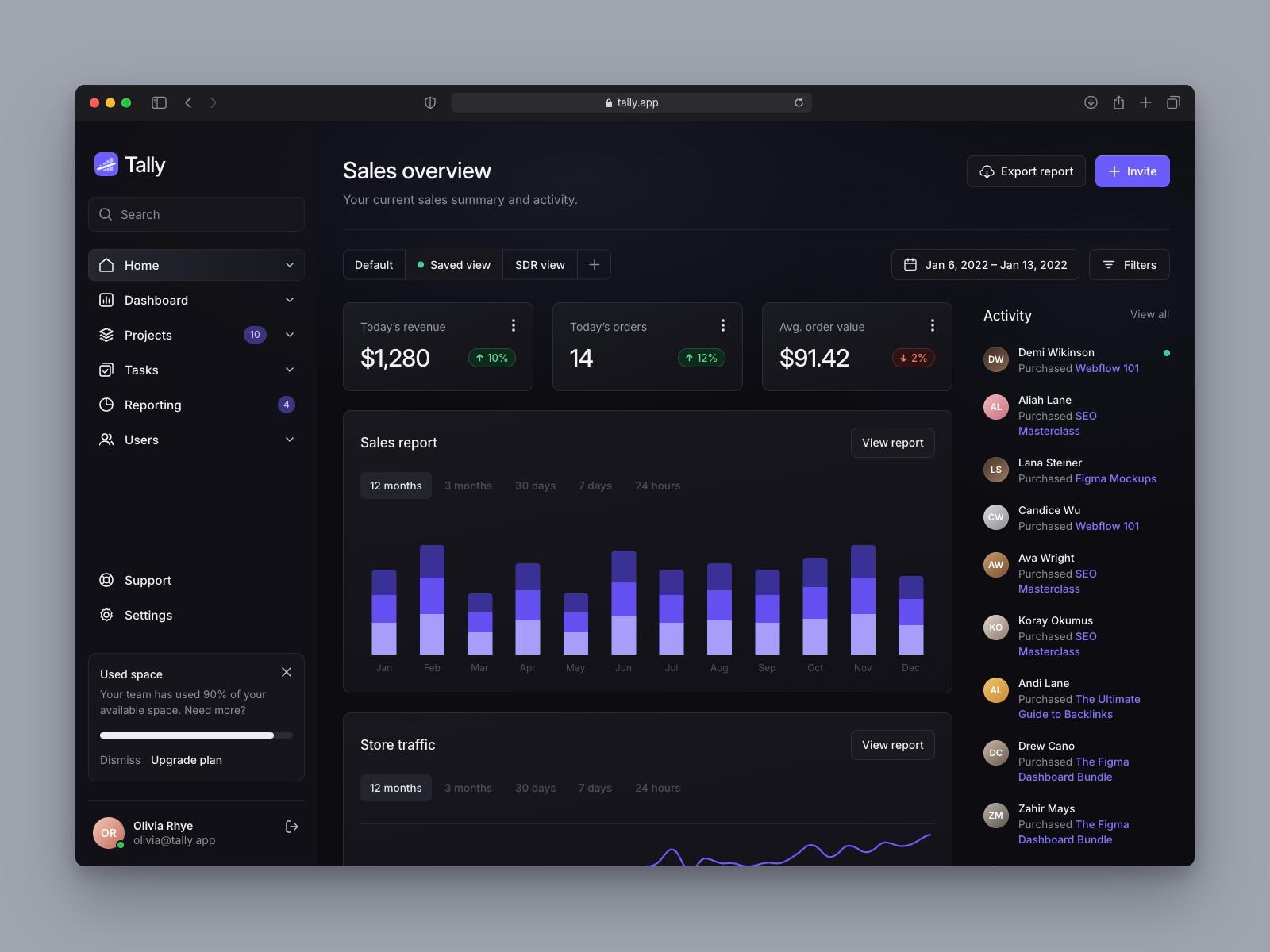
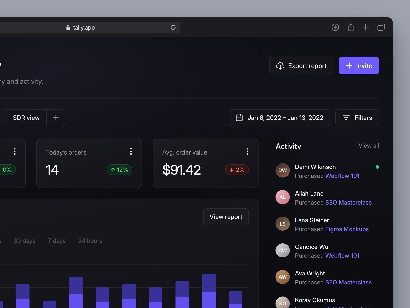
Tally started as a study: we rebuilt a dark sales dashboard concept called Finexa, shared on Dribbble, to learn how it was put together. Credit for that original layout goes to its designer. We then gave it a new name and identity, wrote a marketing site and designed the screens the concept never showed.
- Year
- 2026
- Scope
- Naming, identity, website, product screens
- Platform
- Web app and marketing site
- Type
- Inter and Geist Mono
Study
Rebuilding a concept to learn it
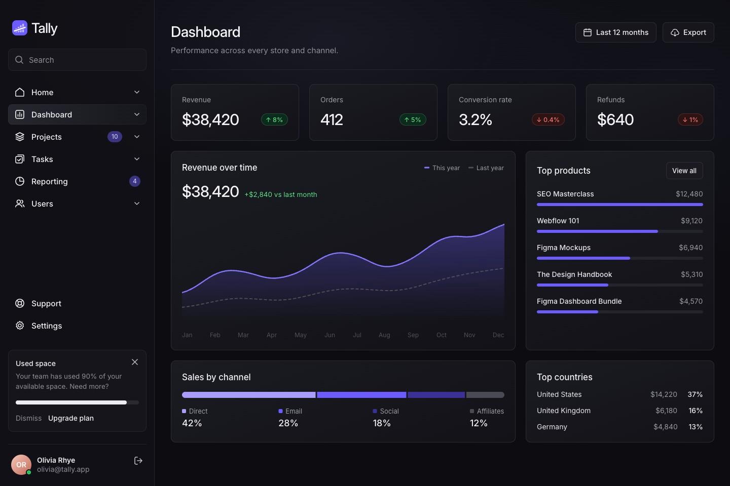
We rebuilt the Finexa sales overview by hand: sidebar, revenue chart, top products and recent orders. Rebuilding it showed how the spacing, the soft gradients on cards and the single violet accent hold the dark layout together. The layout is the original designer’s; everything after this step is ours.
Name
Tally
To tally is to count up and keep score. The name is short, says what the product does and works as a verb: tally today’s orders.

Mark
Four bars and a slash
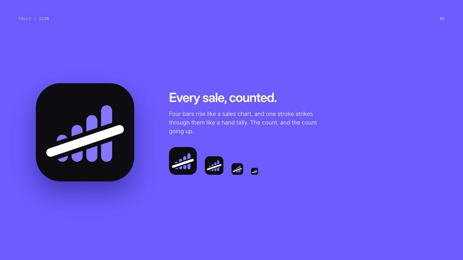
Four rising bars crossed by a slash: a tally mark that also reads as a bar chart going up. The slash is cut out of the tile so it stays crisp at small sizes.
Colour and type
One violet on night
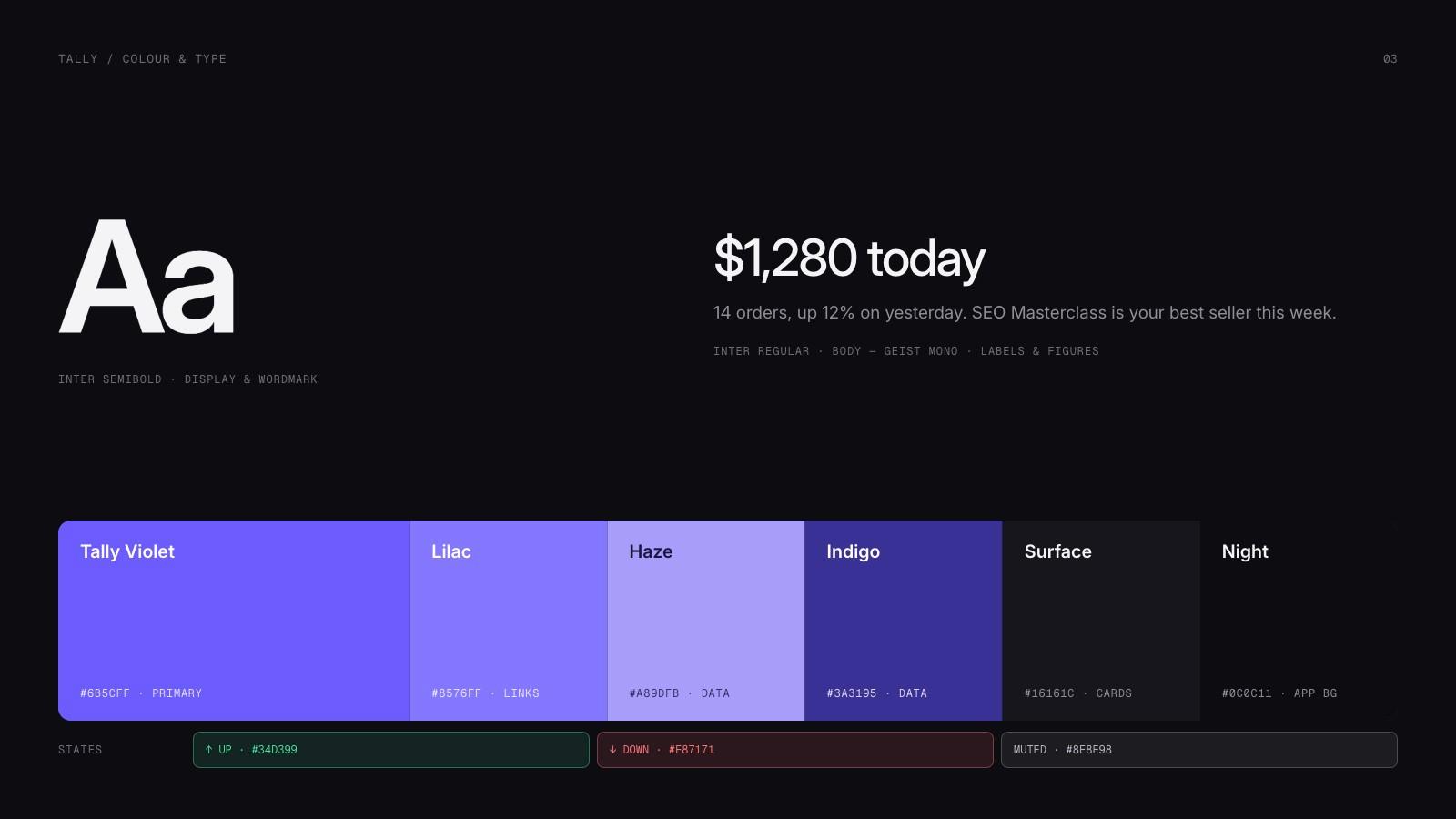
A single violet accent with two lighter steps for charts, on near-black surfaces. Green and red only mean up and down. Inter for the interface, Geist Mono for figures and labels.
Product
The screens the concept left out
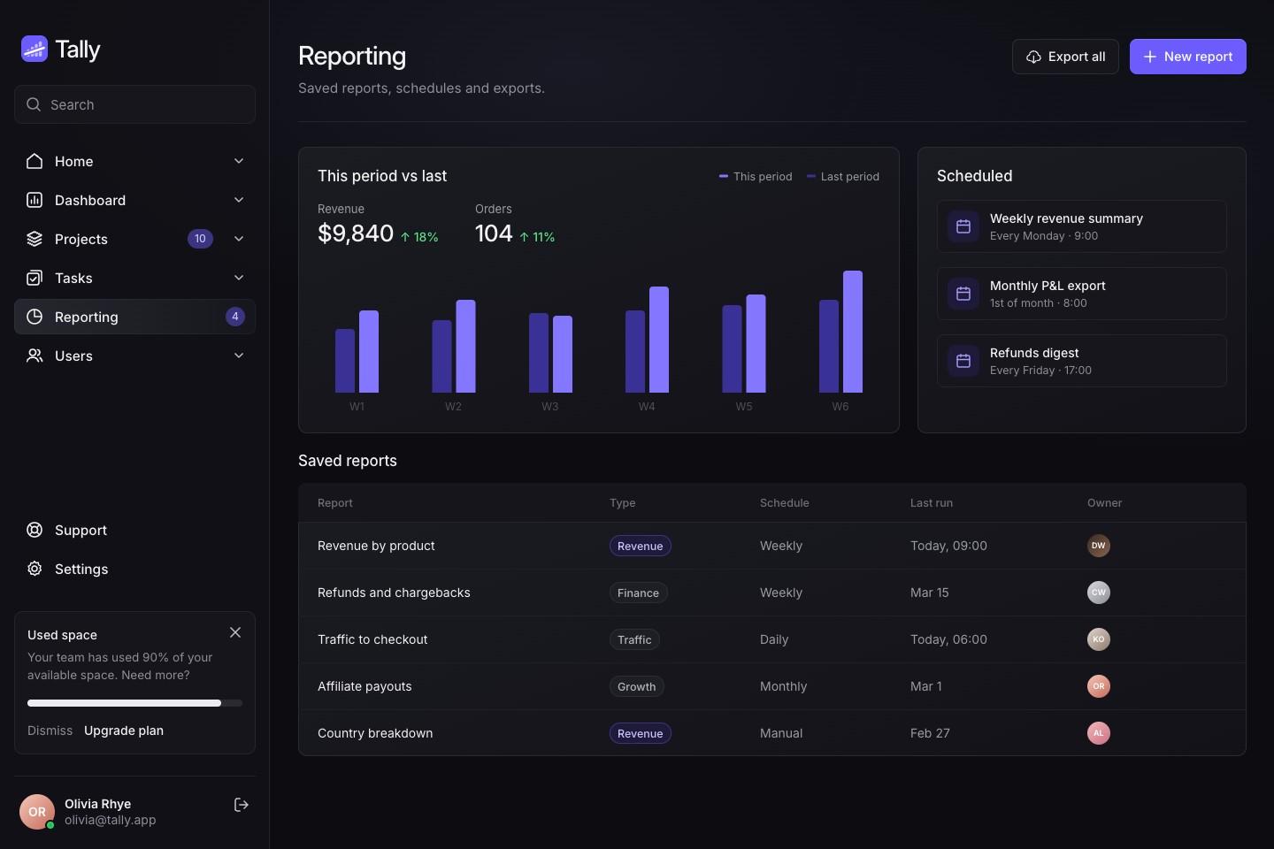
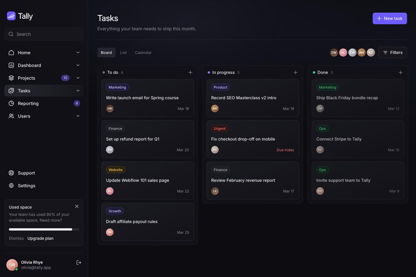
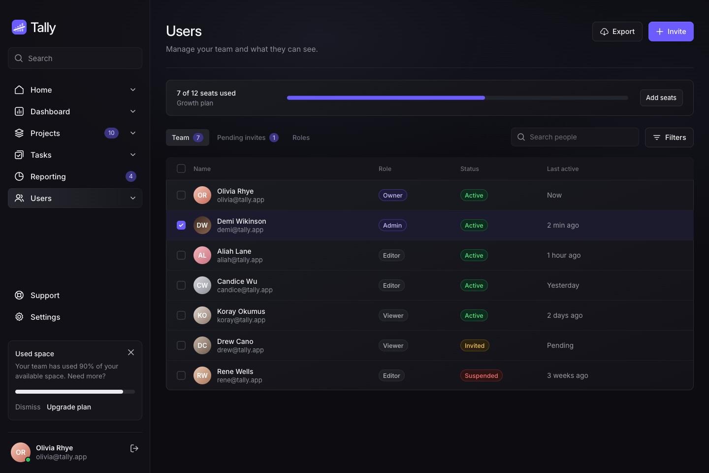
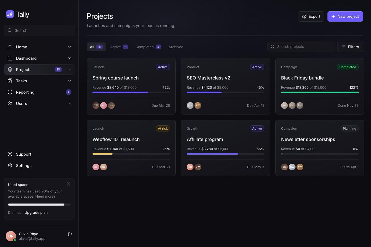
The concept showed one page. We designed the rest of the app in the same system: projects, a task board, reporting and team seats.
Website
A site that sells the count
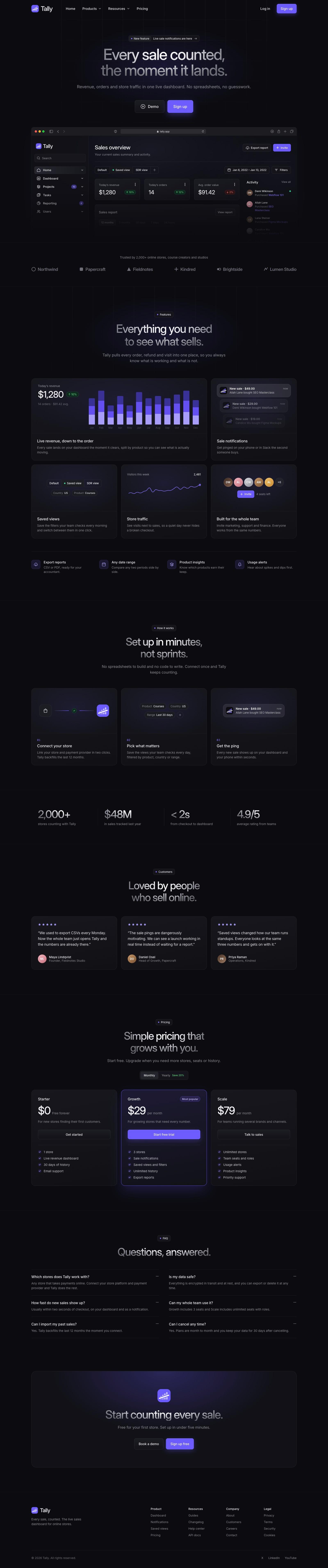
One long page: the product up front, then how it works, numbers from customers, pricing, questions and a last call to sign up.
Launch
Ready to share
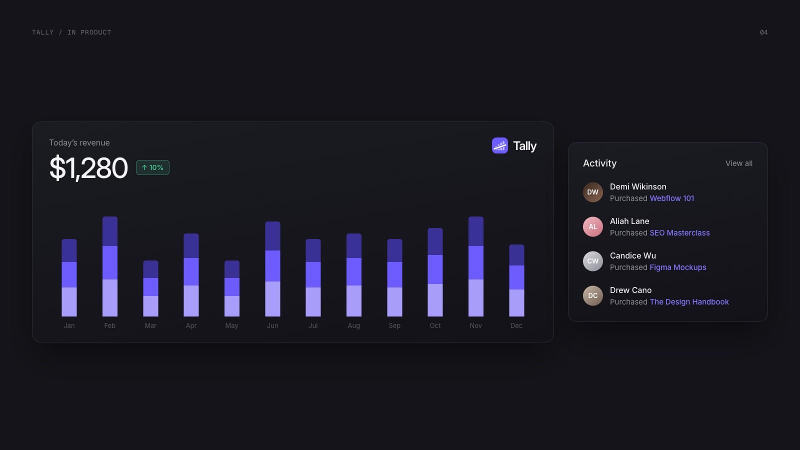
The mark in the product, and a close-up of the dashboard for social posts.
Next project
Pixelary →
Brand identity