Overview
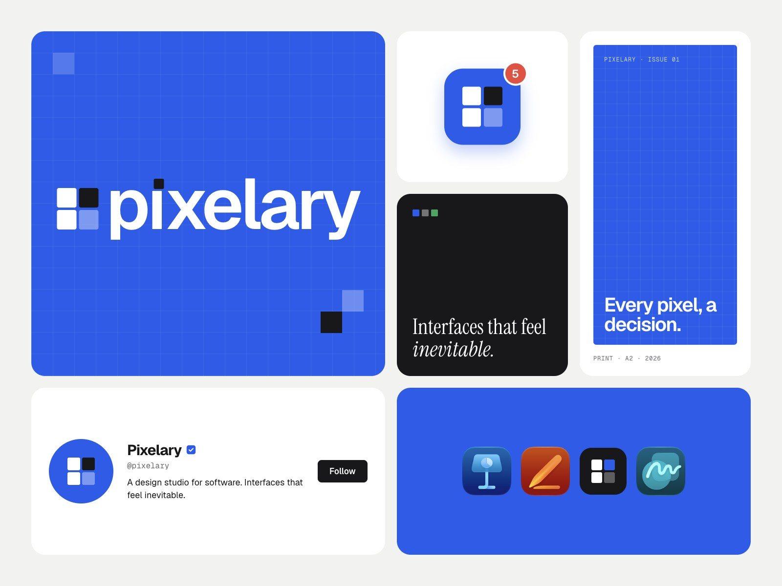
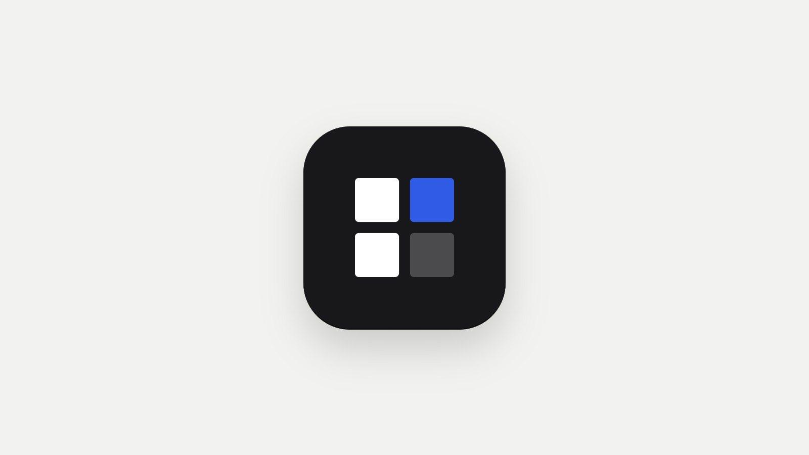
A design engineering studio has to show its taste before anyone reads a word. Pixelary’s identity is built from the smallest unit on a screen: four pixels, one lit, set on a strict grid with no gradients anywhere.
- Year
- 2026
- Scope
- Identity, website, launch kit
- Platform
- Web and print
- Type
- Geist, Geist Pixel and Instrument Serif
Idea
Taste you can see in five seconds
The studio exists to fix interfaces that look generated. The identity had to be the opposite of that: decided, specific and impossible to mistake for a template.
Mark
Four pixels, one lit
A two-by-two block of pixels with one switched on. The same square dots the i in the wordmark, so the mark and the name share one idea.
Colour and type
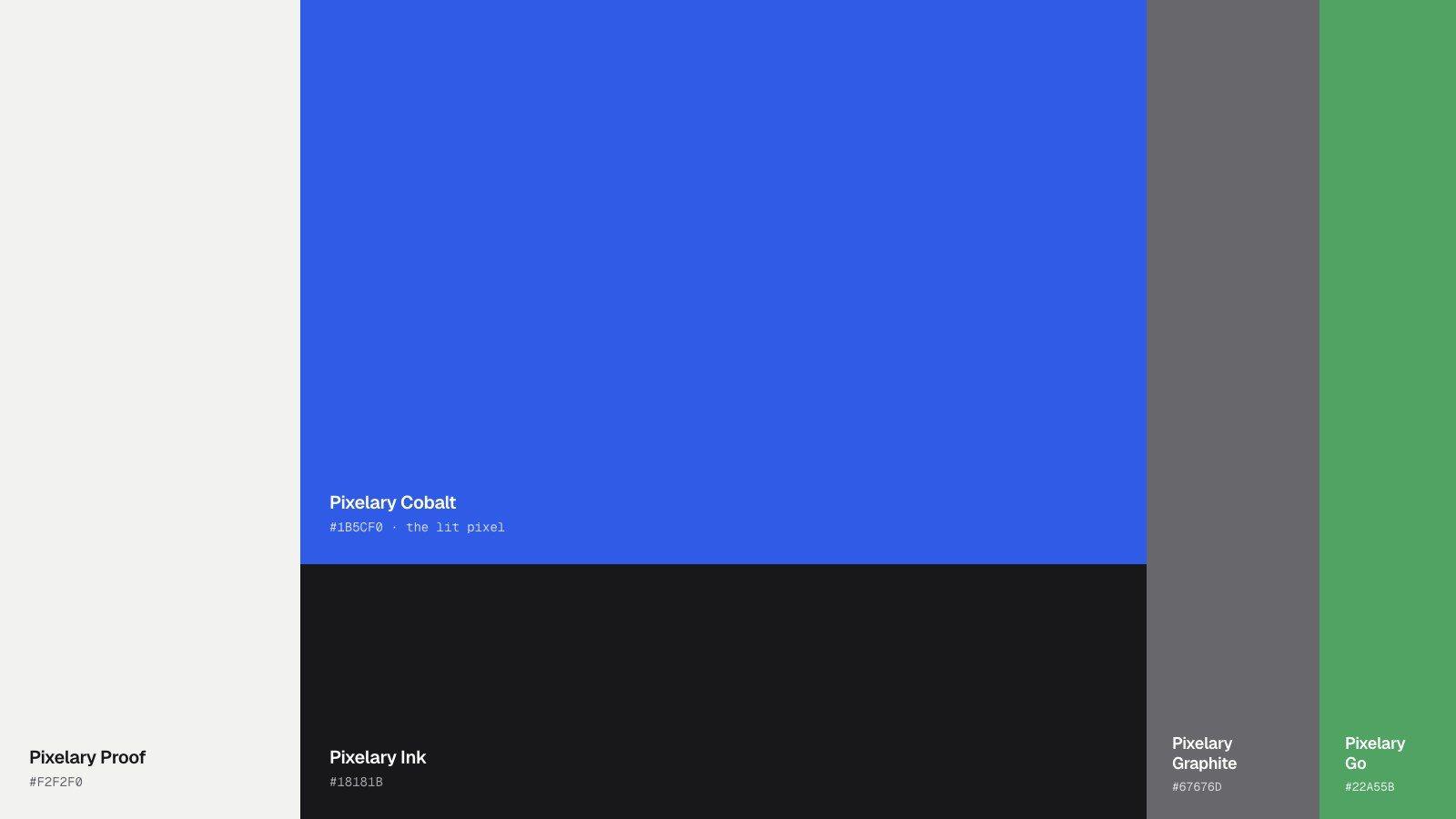
Cobalt is the lit pixel
Proof white and ink do most of the work. Cobalt appears where something is switched on, and a single green marks status. Geist sets the copy, with one Geist Pixel or serif word as the only accent.
Applications
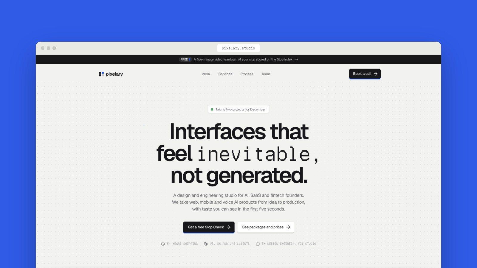
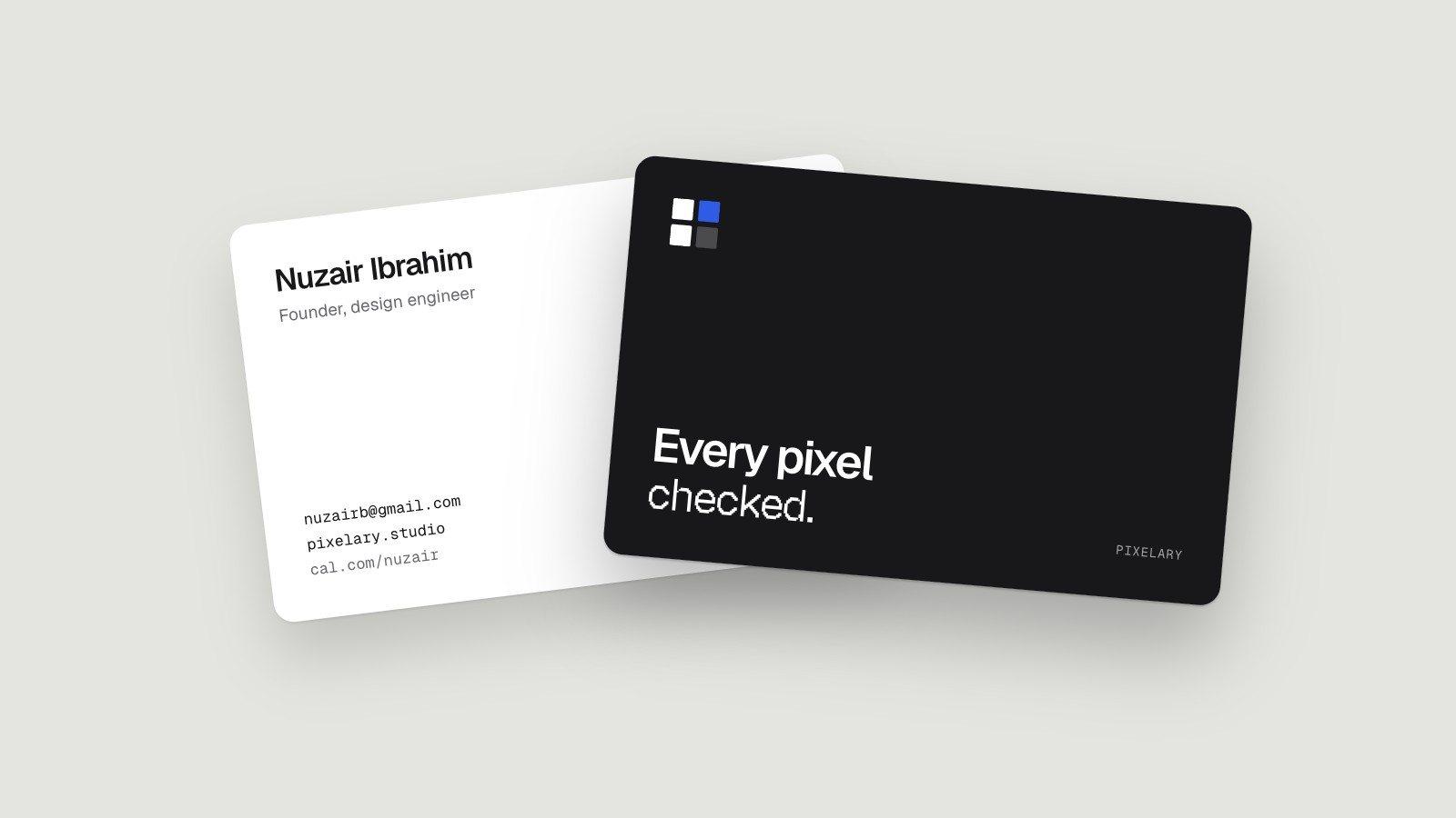
From the site to a business card
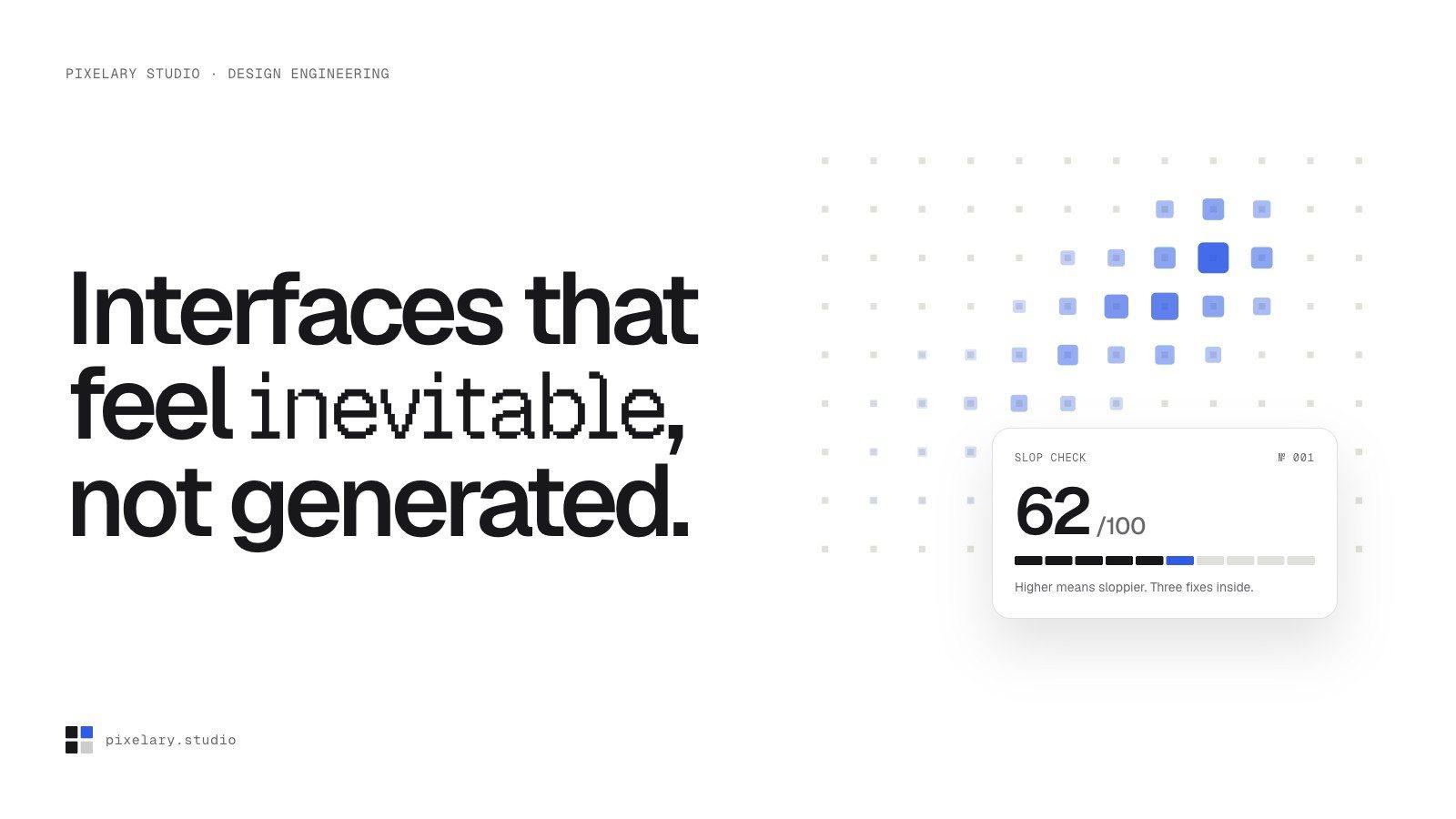
The hero section of pixelary.studio and the printed card use the same grid, the same lit pixel and the same restraint.
Launch
Ready to share
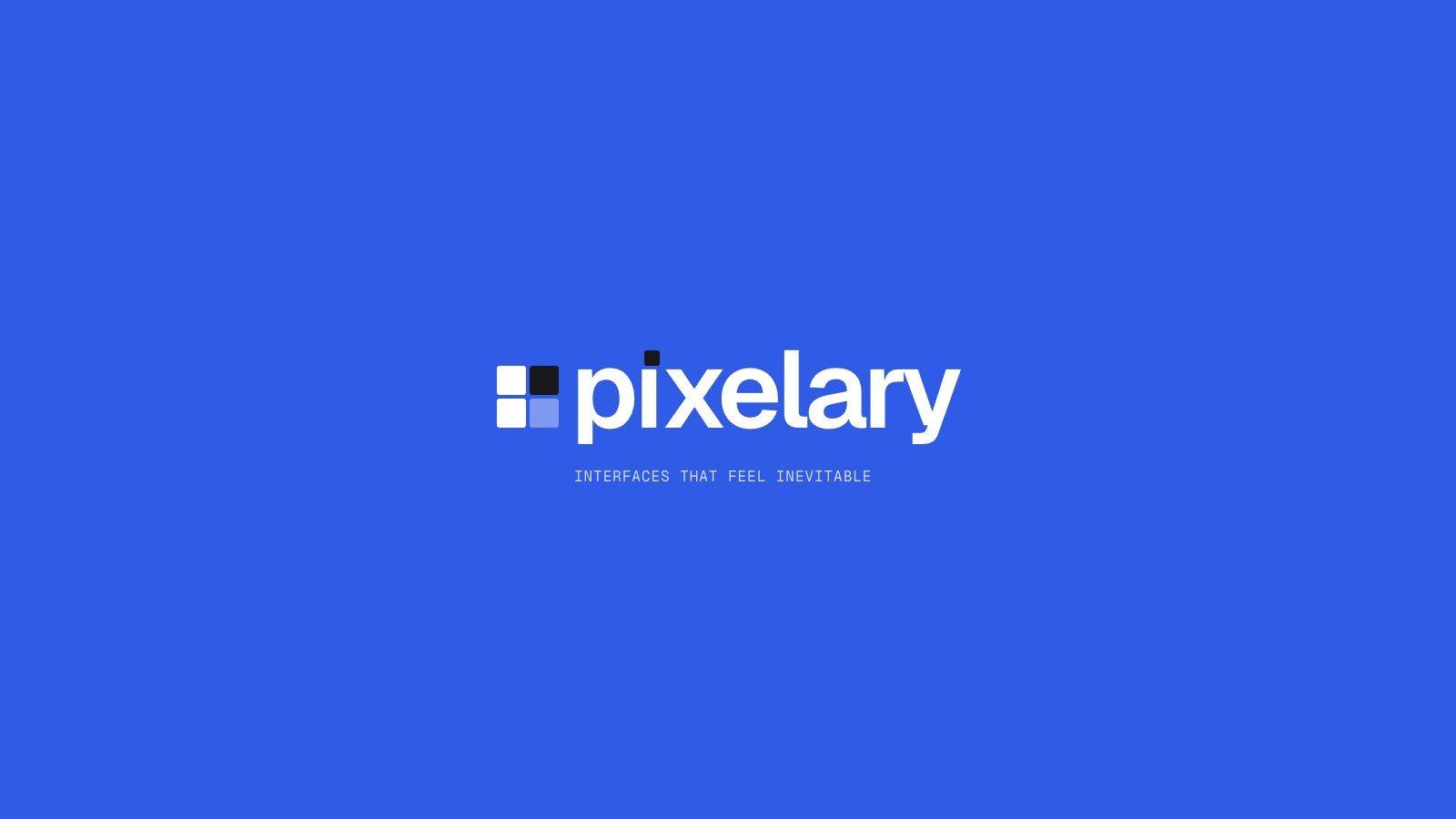
The lockup on cobalt and on ink for social posts and Dribbble.
Next project
Cohora →
Brand identity and revamp