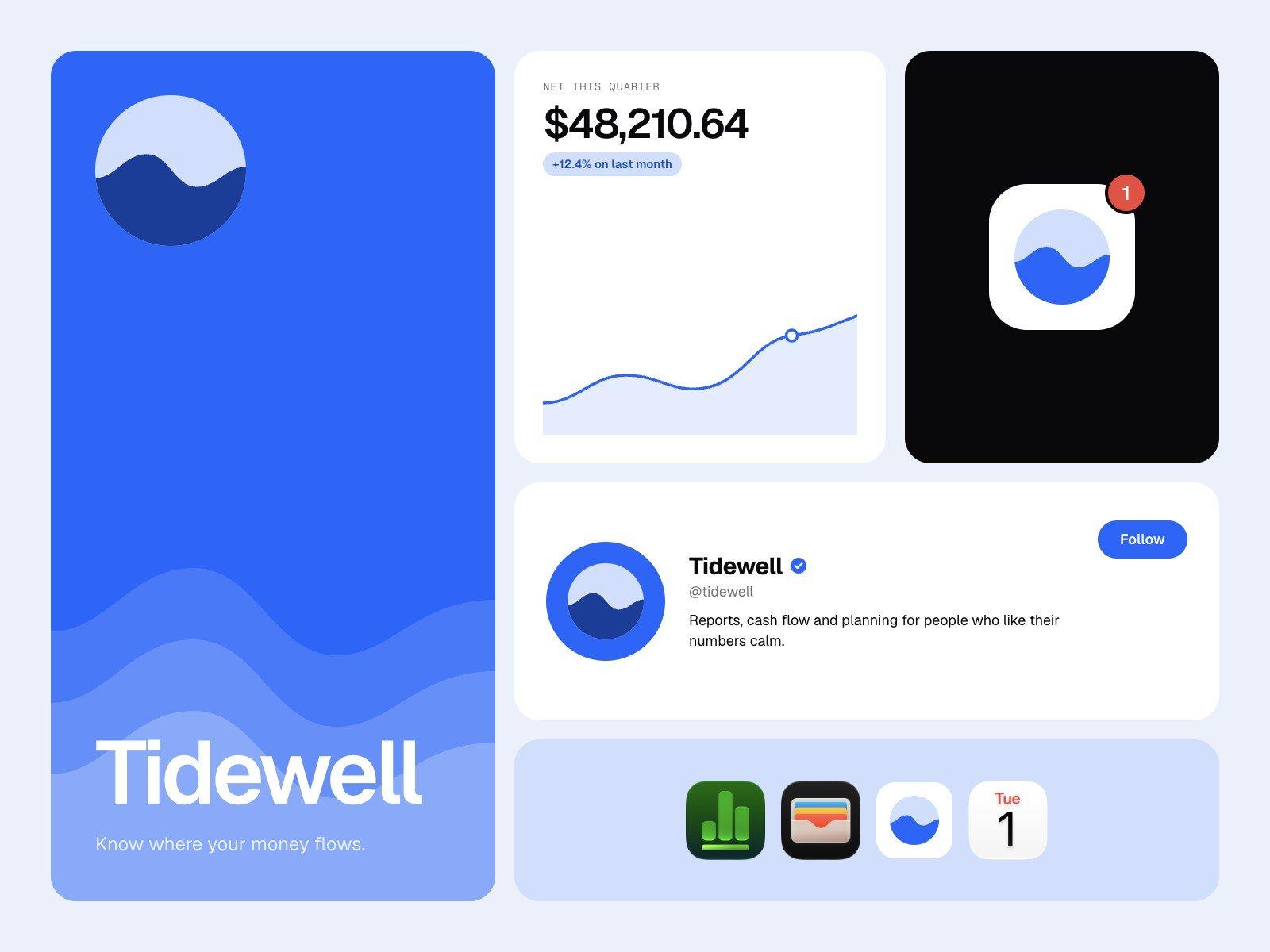
Email automation app and brand
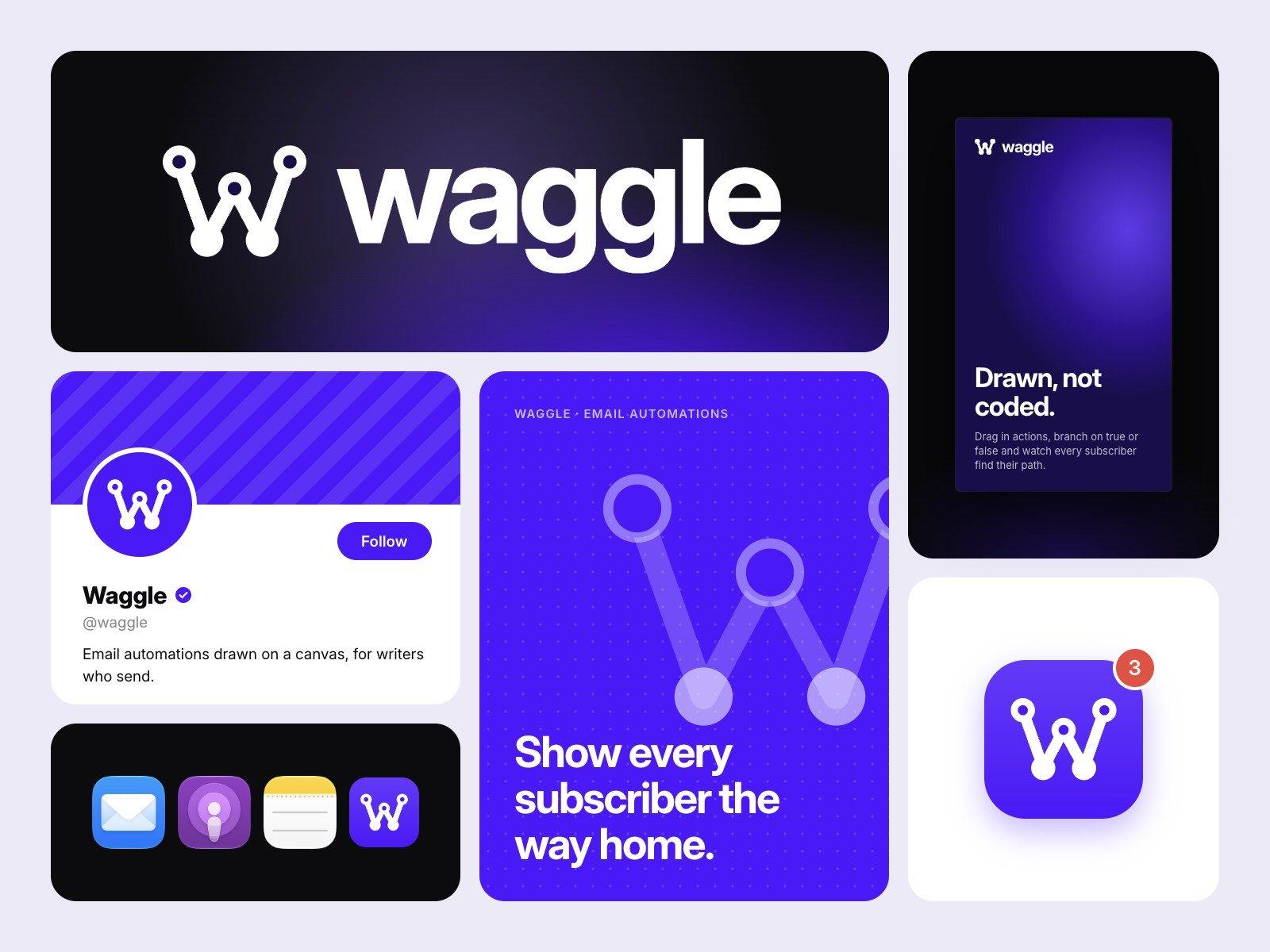
Waggle
Email automations drawn on a canvas, for writers who send.
Overview
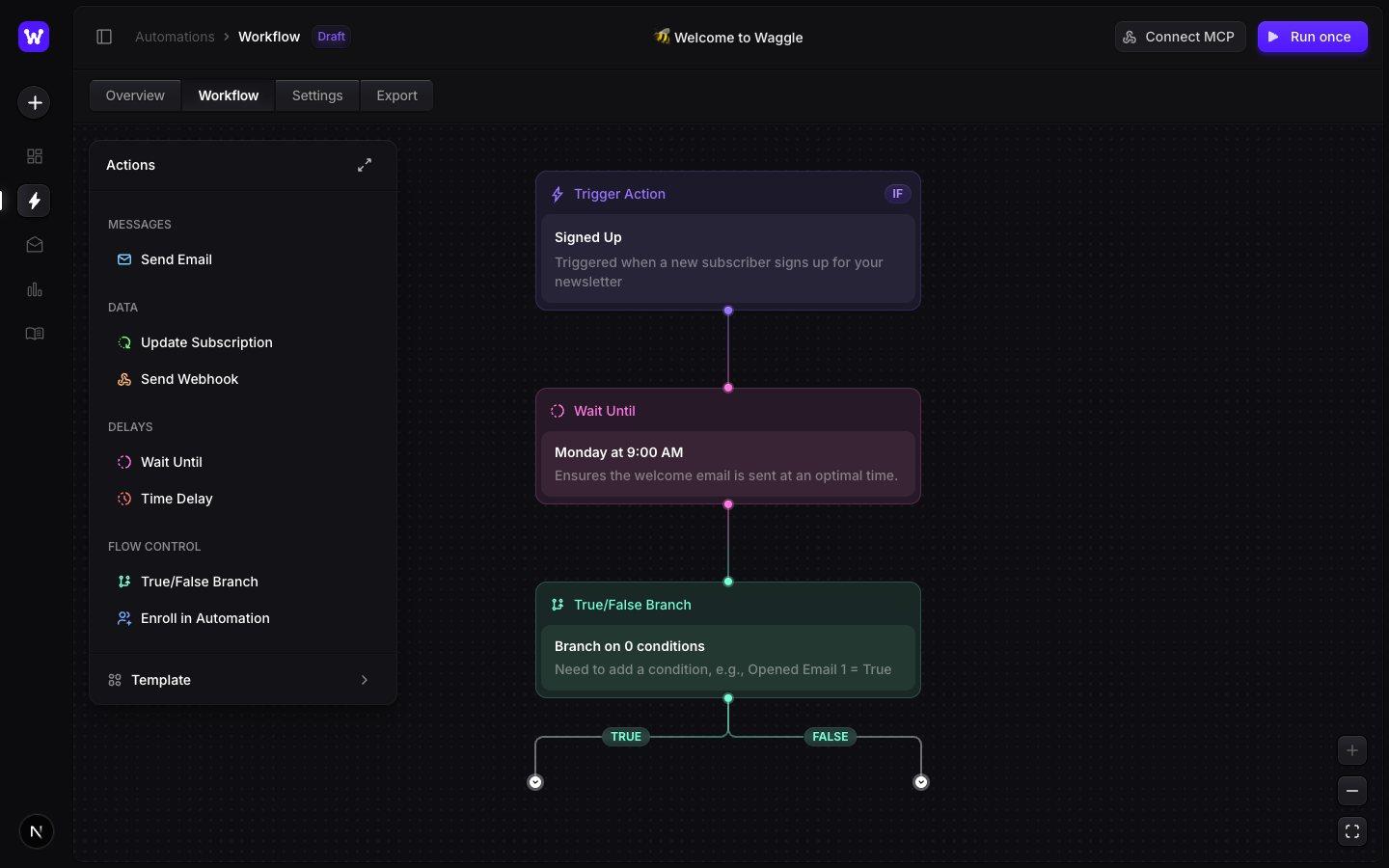
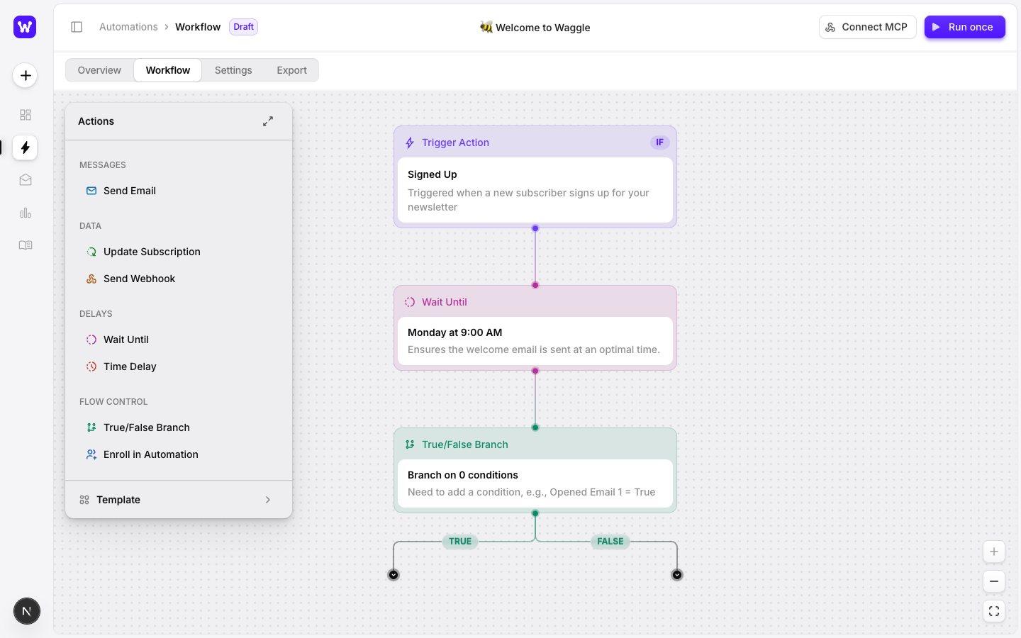
Newsletter writers set up welcome sequences in tools built for marketing teams. Waggle puts the whole journey on one canvas: a trigger, a branch, a wait and an email, wired together like a diagram. We named it, drew the identity, pulled a design system out of the dark editor and gave it a matching light mode.
- Year
- 2026
- Scope
- Naming, identity, design system, light and dark mode
- Platform
- Web app
- Type
- Inter Bold and Inter 550
Idea
A sequence you can see
The working product was a dark node editor called Buzzing Your Inbox. The editor already worked: drag in an action, connect it, branch on true or false. What it lacked was a name people could say and a look that held together outside the canvas.
Name
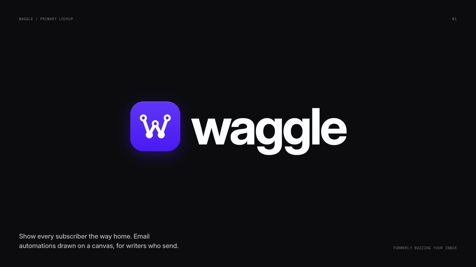
Waggle
Bees do a waggle dance to tell the hive where to go. An automation does the same job for every subscriber, so the name keeps the bee theme without the buzzword. It is short, lowercase and easy to type into a URL bar.
Mark
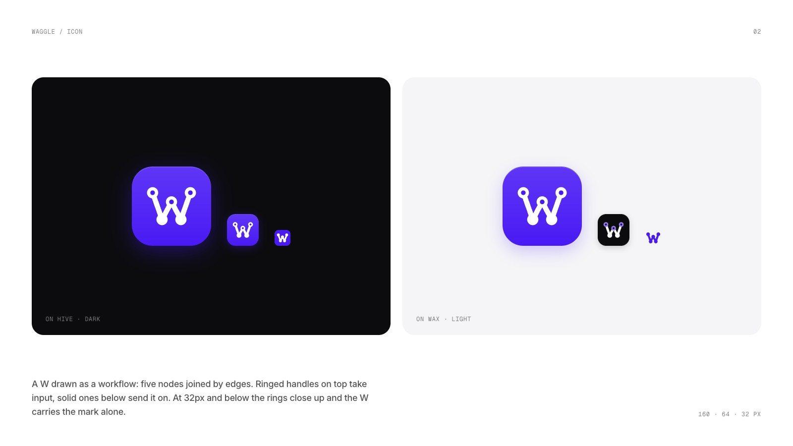
A W drawn as a workflow
Five nodes joined by edges make the letter. Ringed handles on top take input and solid ones below send it on, exactly like the handles on a node in the editor. At 32 pixels the rings close so the W stays legible as a favicon.
Colour and type
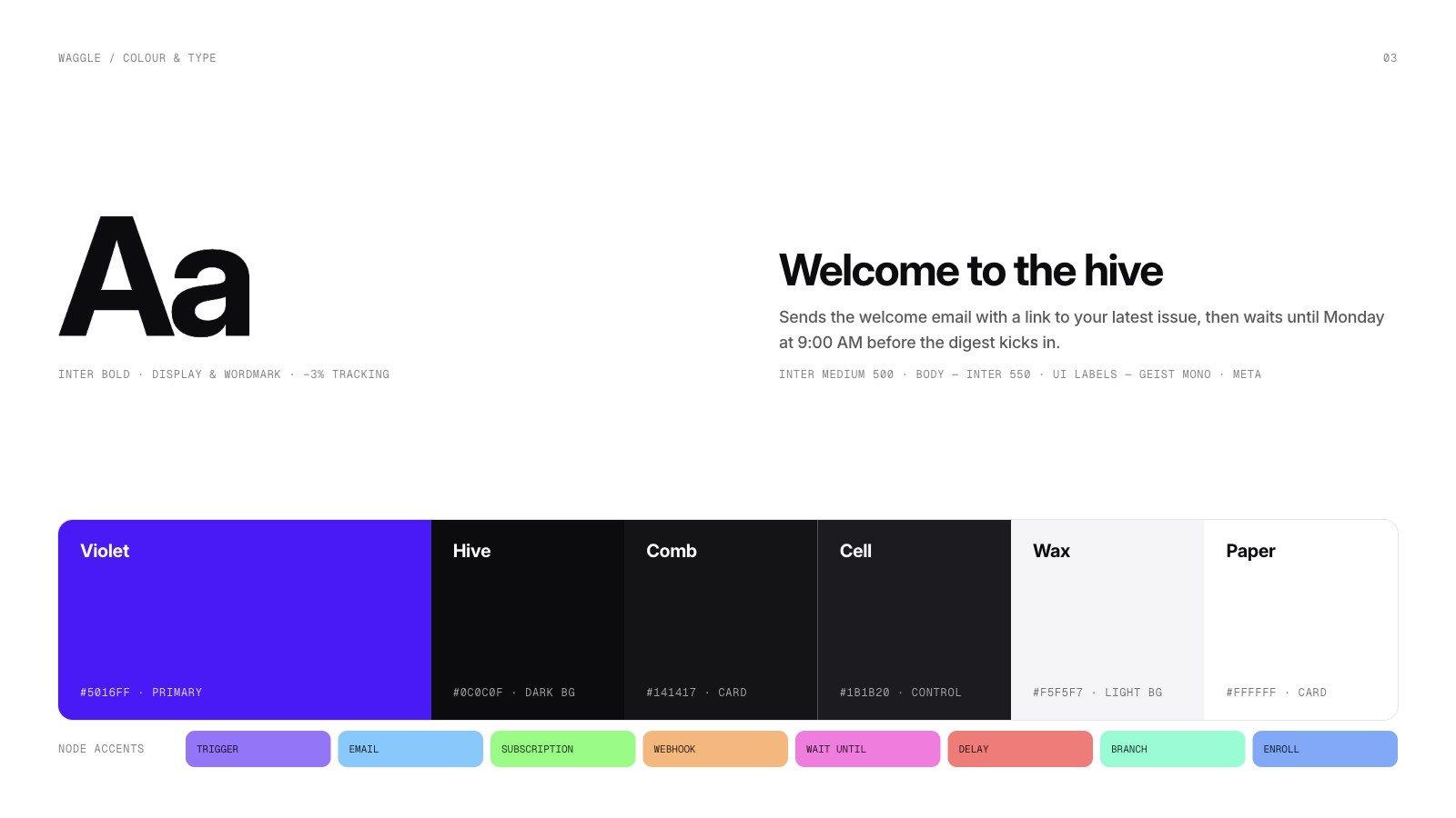
One violet, many near-blacks
The palette came straight out of the code: a ladder of near-black surfaces that get lighter as they rise, and one electric violet for the action that matters. Eight soft accents tag the node types. Inter carries everything at 500, 550 and 700.
Design system
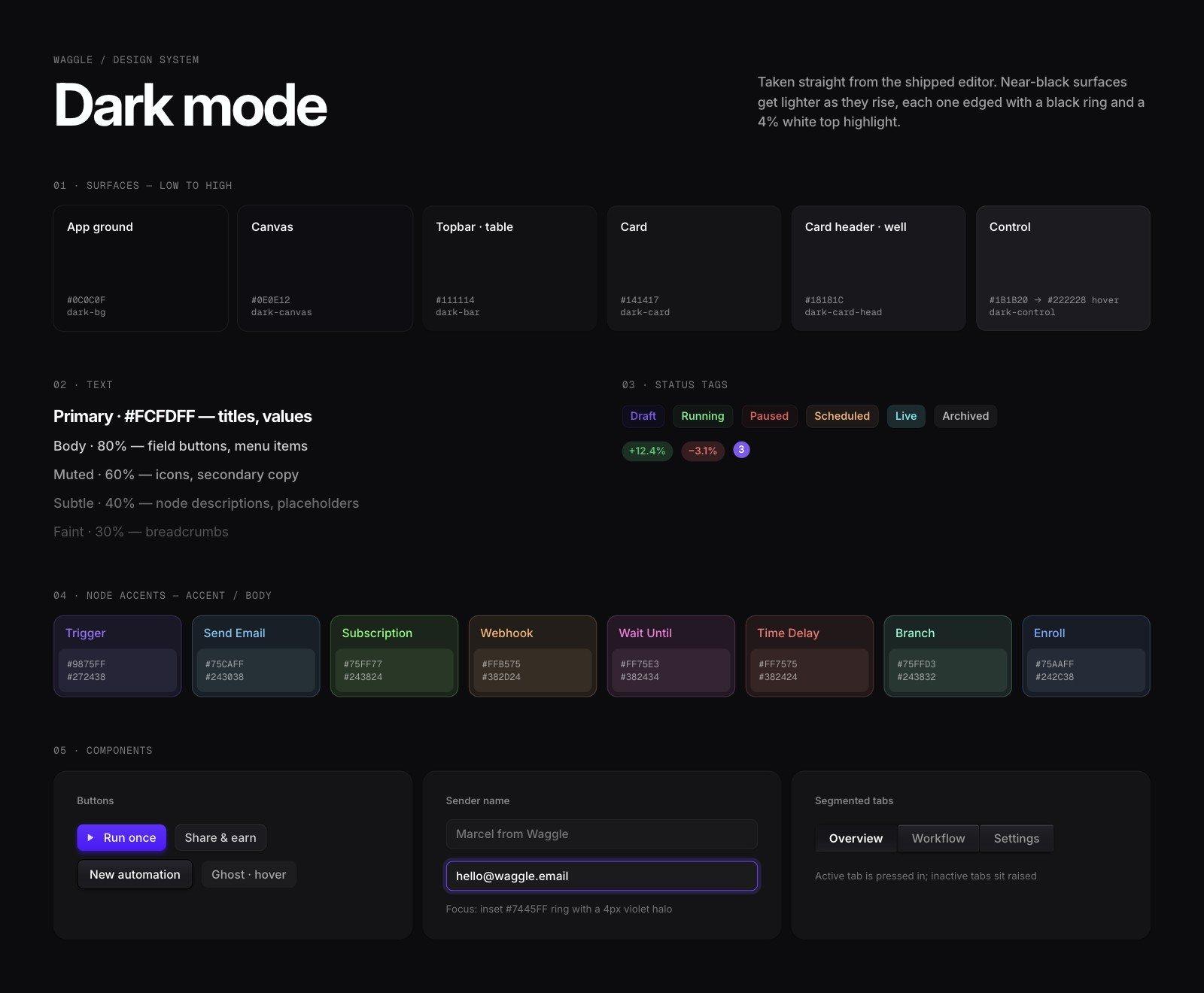
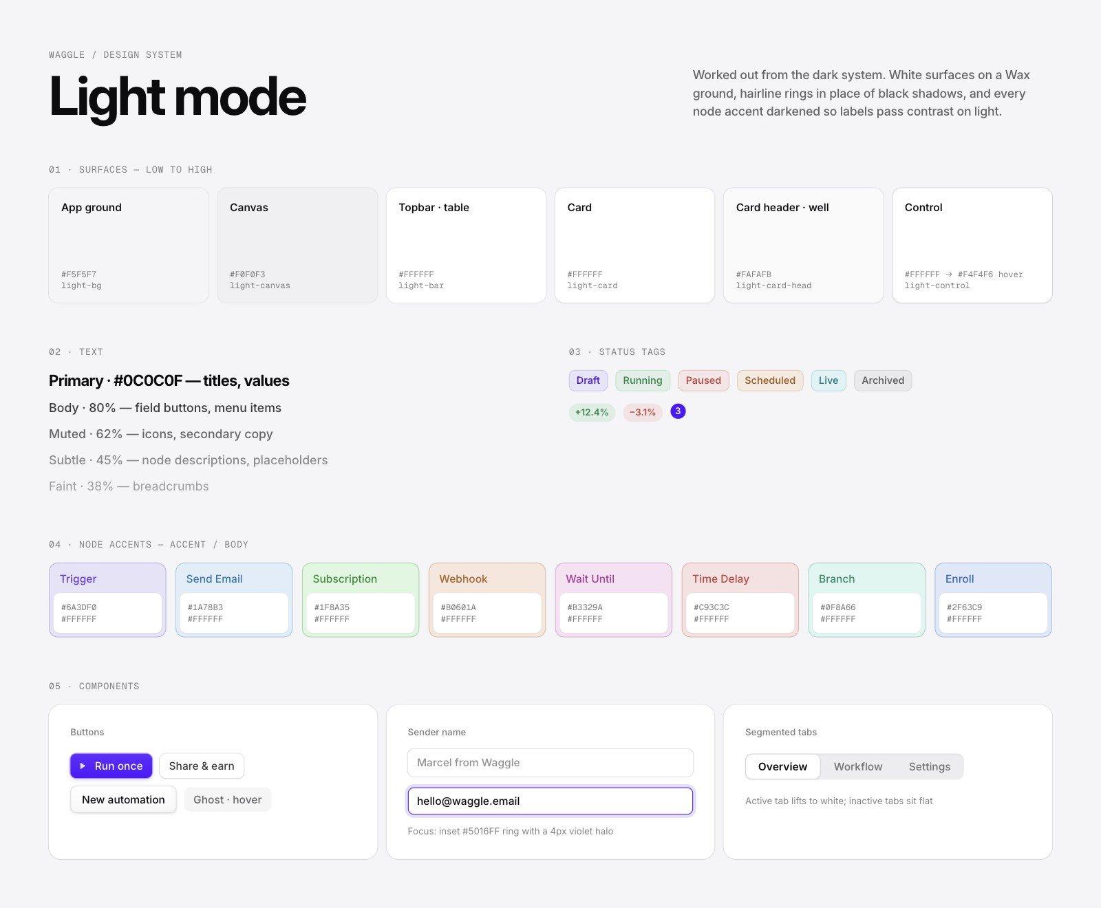
Dark first, then a light mode that matches
We extracted roughly 150 hard-coded colours into tokens, kept dark mode pixel-identical, then designed a light mode on the same scale: white sheets on a wax ground, hairline rings in place of black shadows, and every node accent darkened until its label passed contrast.
Product
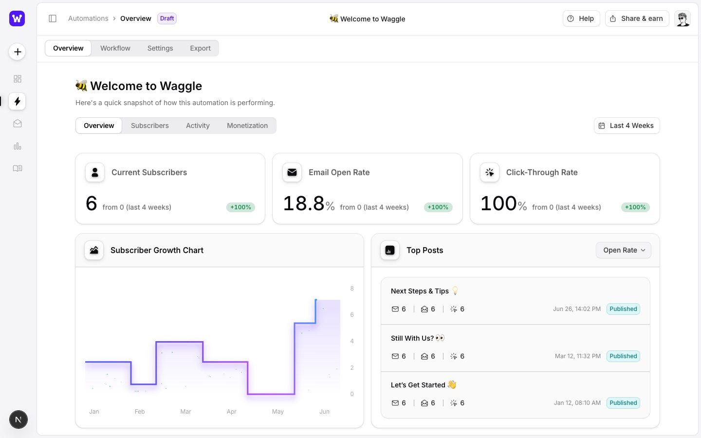
Shipped in the editor
The rename, the new mark and the theme switch all landed in the product. The profile menu gained a light mode toggle that remembers the choice and never flashes the wrong theme on load.
Launch
Ready to share
A launch kit for social and Dribbble: the lockup on violet and on black, plus a full brand presentation with the profile, poster and app icon in context.
Next project
Tidewell →
Finance dashboard and brand