AI browser agents brand and website
Errand
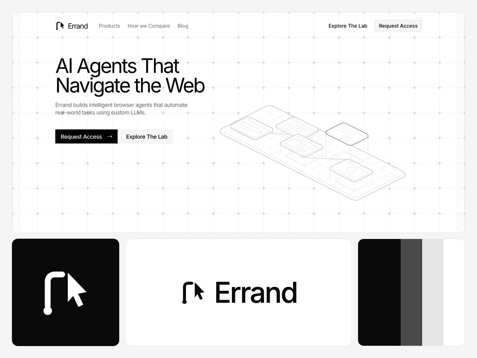
Browser agents that run errands on the web, drawn in black line work.
Overview
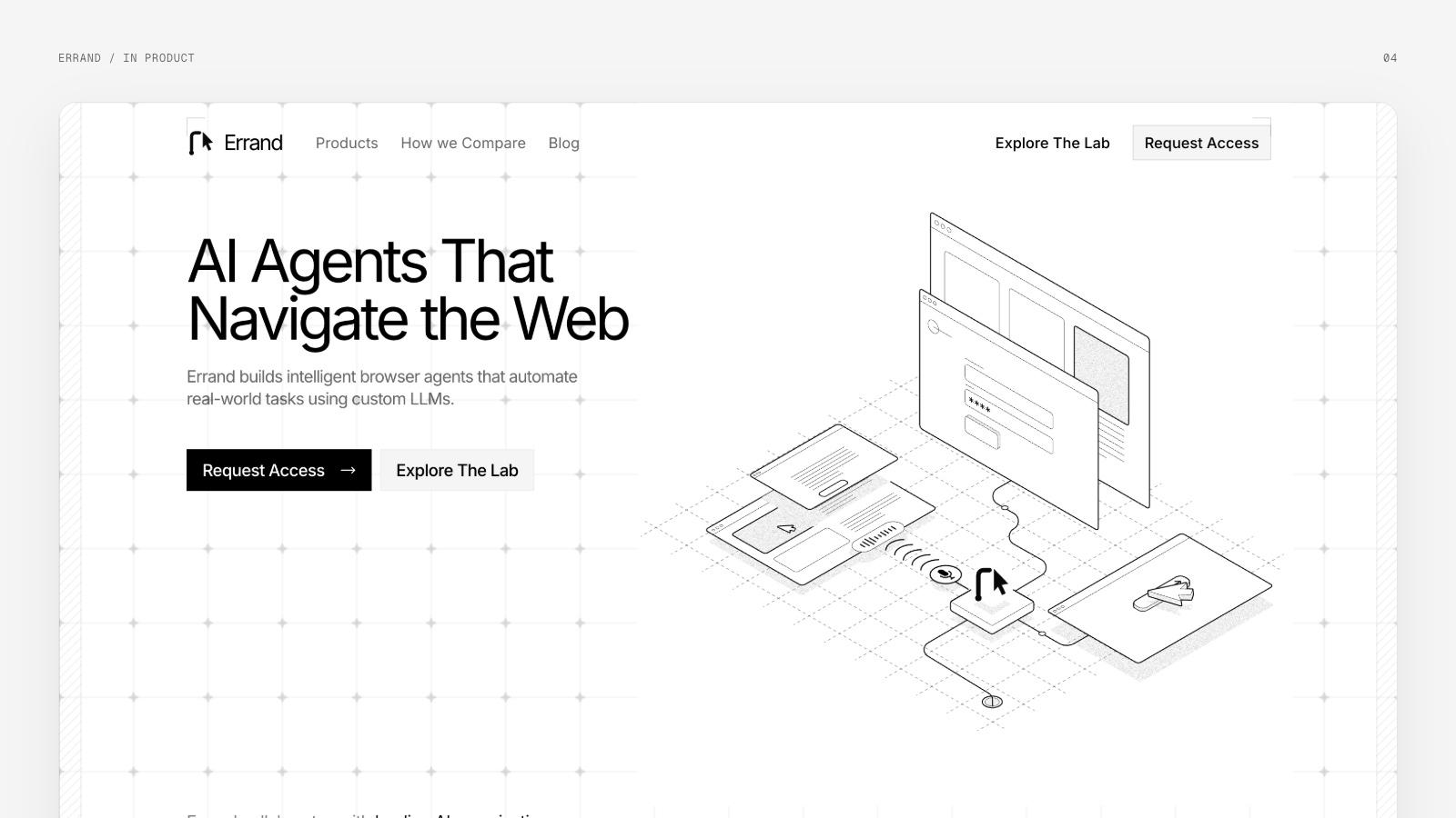
Errand builds AI agents that use a browser the way a person does: sign in, fill a form, pay, move on. The site we started from was called Opero Labs. We renamed it, drew a mark from the path an agent takes, cut the colour down to black and white and replaced its animations with hairline isometric figures.
- Year
- 2026
- Scope
- Naming, identity, illustration, website
- Platform
- Marketing website
- Type
- Inter and Geist Mono
Idea
An agent you send out
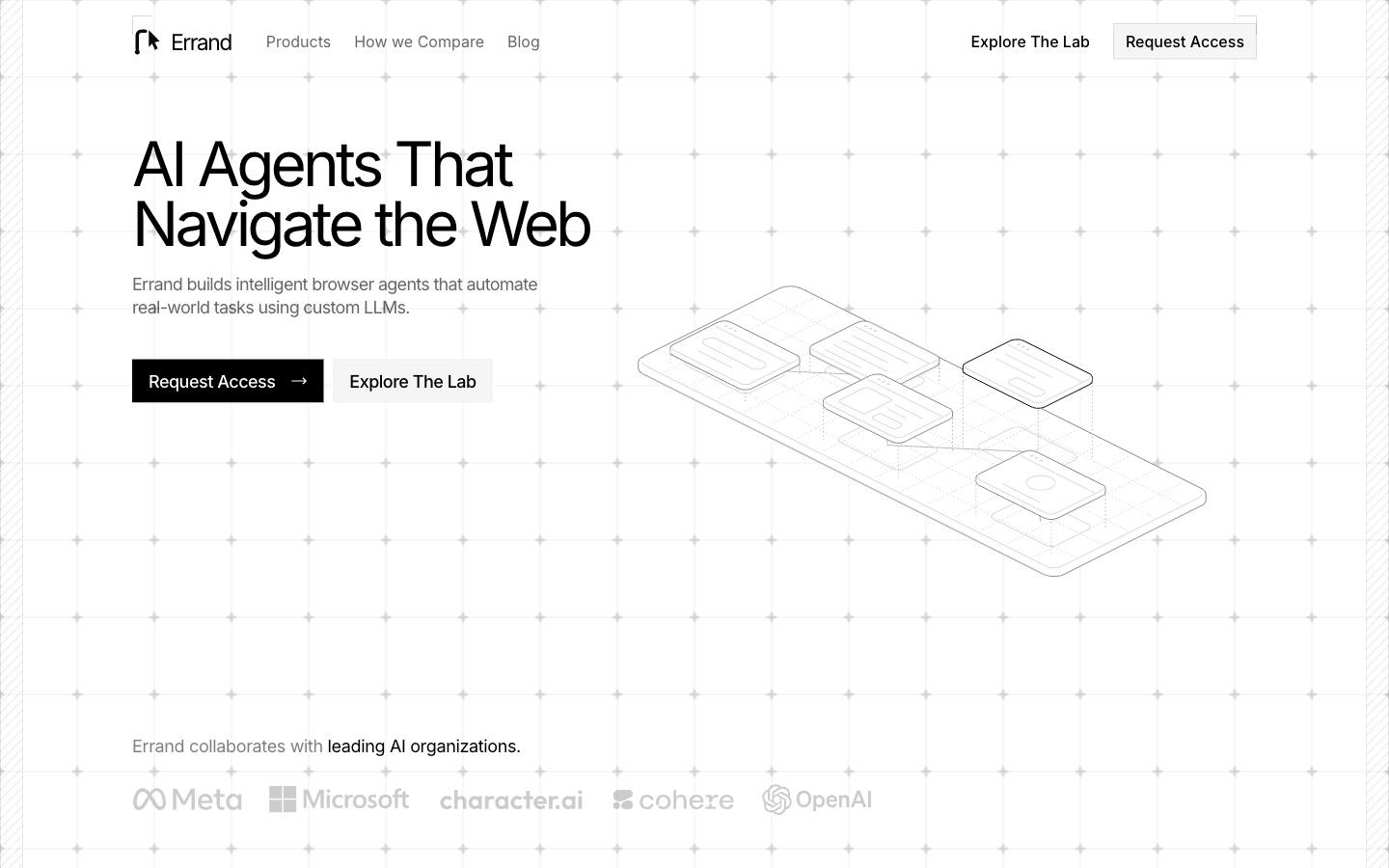
Opero Labs had a clear product and a name that said little about it. The agents do small jobs on the web for you, one page after another. The site needed a name you could explain in a sentence and a look as quiet as a blueprint.
Name
Errand
You send someone on an errand, they go and come back with it done. That is the product. The word is short, plain and needs no explaining next to the line about agents that navigate the web.
Mark
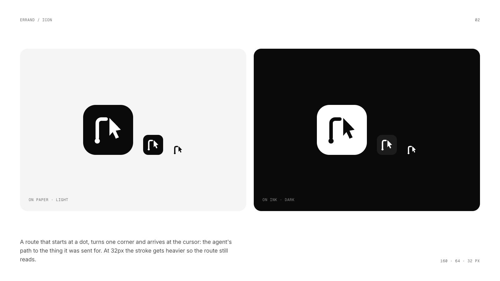
A route that ends at a cursor
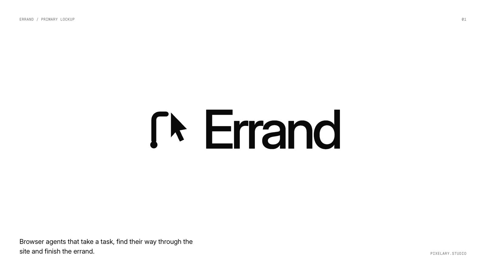
A route starts at a dot, turns one corner and arrives at the cursor: the path an agent takes to the thing it was sent for. At 32 pixels the stroke gets heavier so the route still reads as a favicon.
Colour and type
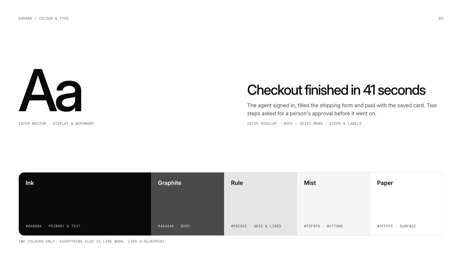
Black, white and line work
Two colours only, with three greys for body text, grid lines and buttons. Everything else is drawn in line, like a blueprint. Inter Medium for display and the wordmark, Inter Regular for body, Geist Mono for steps and labels.
Product
Hairline figures in place of animations
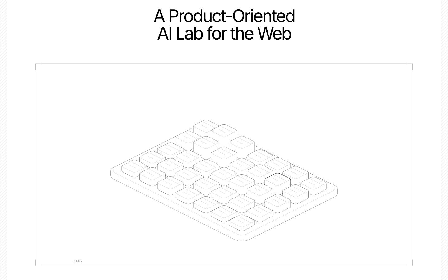
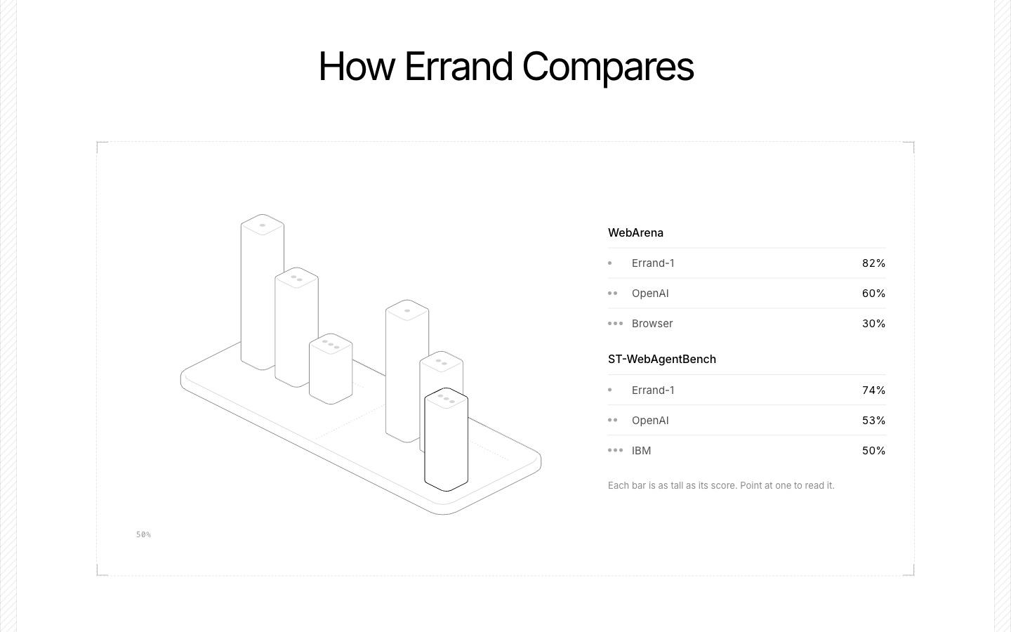
The old site used six Lottie animations. We redrew each one as a hairline isometric figure: a route, a test field, layers, tabs, voice and scores. Each figure plays a short tour on its own, and the comparison chart reads its labels from a key whose dots match the dots on each bar.
Launch
Ready to share
The new mark in the navigation, the hero and the open graph image, all in the same black line work.
Next project
Flume →
Data sync brand and website